Summary
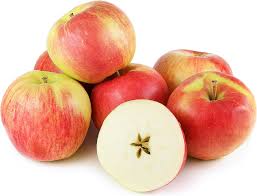
In partnership with Washington State University, Sunrise Magic® brand apples are being re-introduced into the marketplace. With help from consumers, the name was chosen for WSU’s WA 2 apple during a series of polls. Sunrise Magic® is a cross between a Splendour and Gala, which have both been successful in the commercial market. With an attractive pinkish-red blush and moderate acidity, Sunrise Magic® is perfect for fresh eating.
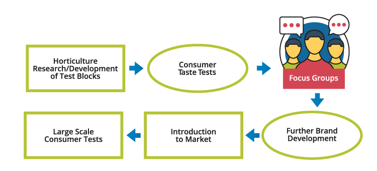
Consumer Insight
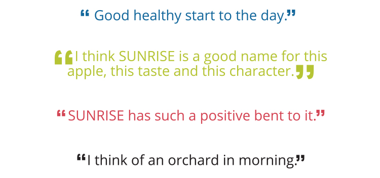
Focus Groups

Focus Groups
Brand Development
Finding a brand that resonates with consumers is a critical initial step in developing a new variety. When Sunrise Magic® apples gained media attention, we began to develop a brand that could make an emotional connection with the consumer. After observing two focus groups in Spokane and Seattle, the participants noted that the light, blush color of the apples reminded them of a pleasant sunrise at an orchard. Kathryn Grandy, Director of Marketing at PVM, said, “It is mild and refreshing, it would be a light way to get a fresh start to your day.”
A Tale of Two Logos:
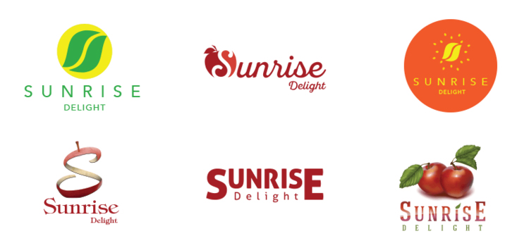
Logo Design Round 1.1
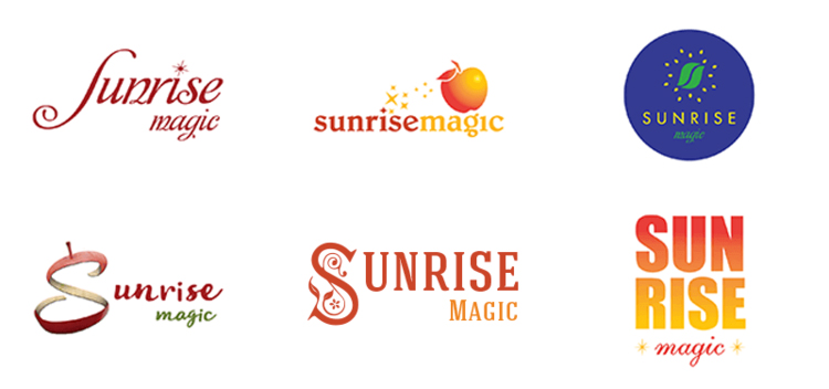
Logo Design Round 2

Final Logo Design
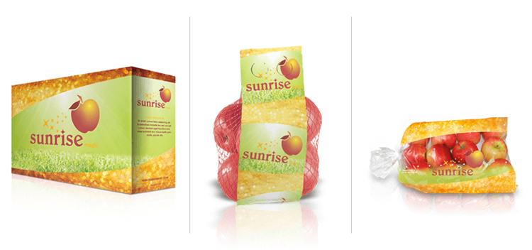
Packaging & Web Design
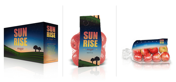
Packaging Designs Round 1
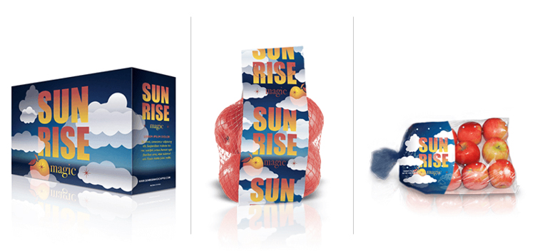
Packaging Designs Round 2.1
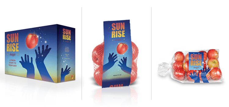
Packaging Designs Round 2.2